

User Experience in Game Design
-
Lead UX Designer in Mainframe Studios.
-
Principal Designer at Epic Games.
Aalto’s Devlog #8 / 4th October 2023
We had an introductory lecture on User Experience design in games by Jasmin Dahncke, lead UX Designer at Mainframe Industries. She stressed the importance of having game experiences that relate to humans, and that use data and player behavior to improve their design choices. It can take many forms, from the UI to the subtle animations on the menus. Alternatively, I found a talk by Epic Games’ Jim Brown where he discussed the effect that game design choices have on UX. Both of the lecturers used Gestalt psychology to analyze their images and data, and in this reflection, I will use the same tools mentioned both in the video and the lecture to study two images that I created for our game project.
Game Design: UX
About the Lectures
Video links
In this reflection, I will make a UX-oriented analysis of these two images, which are concept art illustrations for our game projects. In them, I tried to capture the essence of two chore mechanics in our game: Exploration and Combat. They are not screenshots of the actual game, and there will probably be more elements on the screen at the time when the game is ready, but I believe it offers an interesting analysis opportunity since the goal of these images is to show the player’s experience.


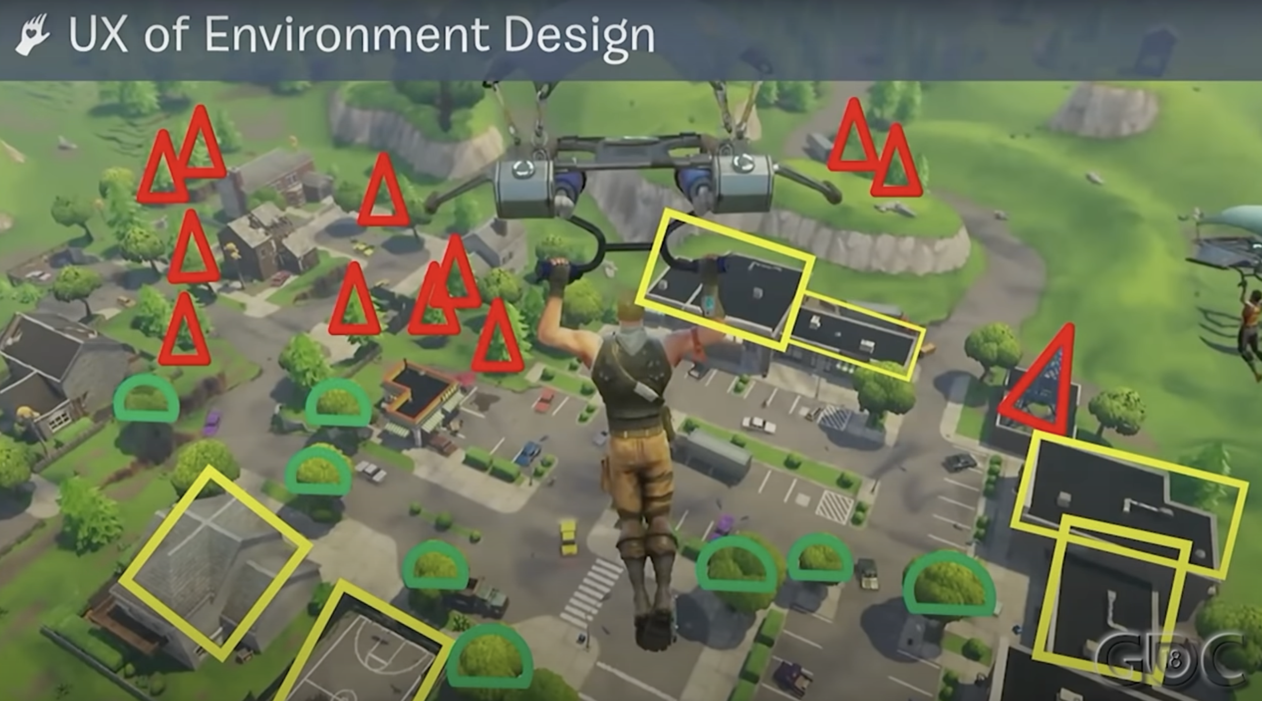
The idea for this exercise was inspired by Jim Brown’s talk. In particular by the image analysis pictured below. It is a screen capture from one of the starting points of Fortnite, where he used a shape guide to study the different landing possibilities in this particular area of the game. Landing areas in Fortnite are designed carefully to help players decide their starting point in the game. In this case, shapes help point out the ideal landing spots and they also are used to warn inexperienced players of the most conflictive areas on the map. I believe this is a brilliant idea and it integrates perfectly with the player’s immersion in the game.

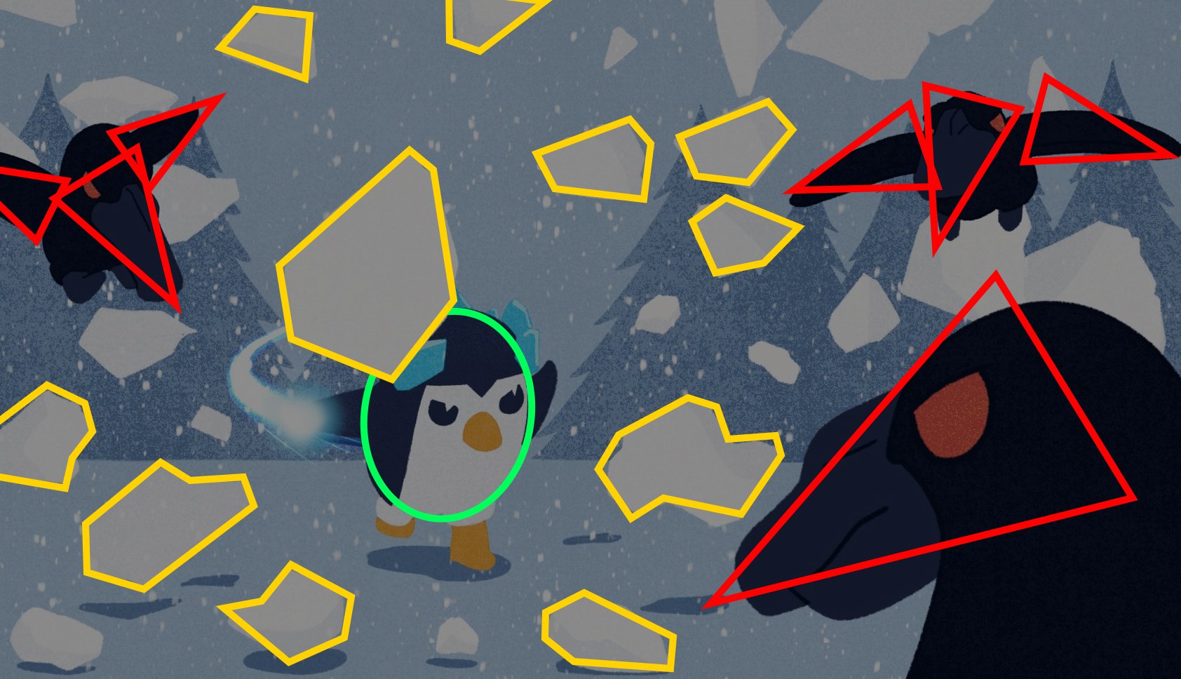
I used the same analysis technique in my artwork, and it was fascinating to see how those principles apply perfectly here. In both images, the player’s shape is mainly round and the intention behind it is to show users that this creature is vulnerable and relatively harmless. Nevertheless, it will use skills and power-ups to fight its way along the game. This is shown by its snow attacks which break into squared shapes. This was an unintentional choice, probably following my instincts as a designer, but the analysis revealed that there was meaning behind this choice. It shows useful abilities that will help players and their shapes apparently do so.
Furthermore, the path of our player won’t be easy. They will face dangerous situations and they are part of the images too. On the one hand -and the most obvious one- is the illustration from the right. Enemies surround our hero, and their attributes use triangular shapes in their beaks and wings to warn of their dangers. On the other hand, the image on the left is more subtle. In this case, no enemies are in sight, but the intention is to give a sense of danger and tension using negative space. The woods in this case serve as a warning, telling players to be ready to face challenging scenarios and the triangular shapes of their shadows help to tell this idea. This was definitely an intentional idea, since I was looking for this tension while composing the image.

There are other interesting tools for studying the images. For instance, different composition rules help the eye to read better the images. I used the rule of thirds in the combat illustration to understand the placement of the elements and I realized that I could improve it by slightly relocating the character’s position. This is definitely an improvement I will make on the final illustration, and it is a great example of how UX principles can help different parts of the development process.
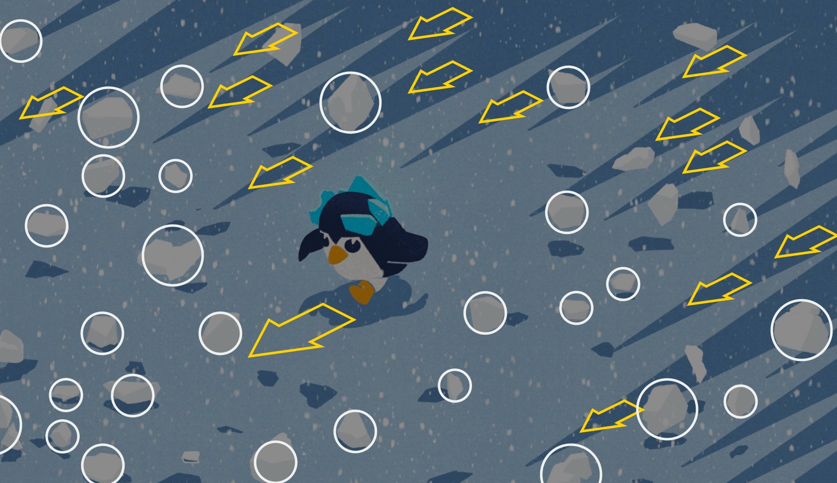
Additionally, I was eager to know if I could find more Gestalt principles in the first image. I could find at least two of the principles mentioned during the lecture: The law of common fate (in yellow) and the law of similarity (in white). Both principles help to give a sense of movement and to tell a story in this apparently minimalist image. From one point of view, the law of common fate applies direction and gives the viewer the idea that everything is moving to the left side. From another point of view, the law of similarity groups elements together by shape and colour, but it also adds a chaotic element to the image by its random distribution and difference in size.
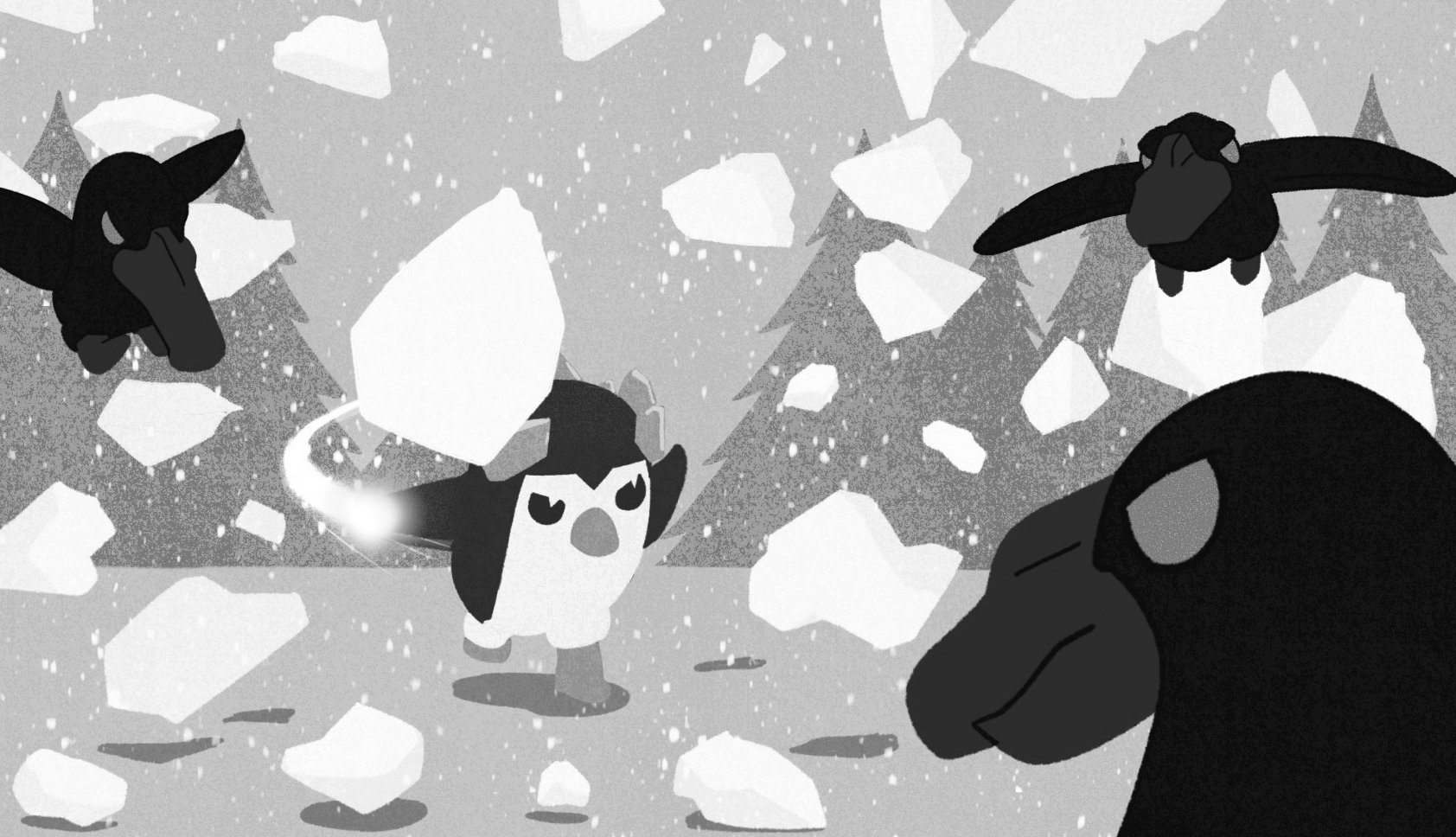
As a bonus, I found the law of closure applied in the animation frames of the character where we see a snowball even though it is fragmented. And I would like to highlight a technique that I personally use in my projects, which I believe applies to the UX premises presented in the lectures. I usually switch the image between black and white and colour to ensure that the image’s contrast reads well and all the elements are easily recognizable at the first glance.
Gestalt principles: Rule of common fate and similarity

Using the rule of thirds to create a better composition

Gestalt principles: Rule of closure
Switching the image to black and white to ensure good contrast
More from Aalto’s Devlog:
-

Untitled Penguin Game (1/3)
Period 2 - Game Project I
-

Airplane control and procedural map in Unity with C#
Period 1 - Software Studies for Game Designers
-

Game Jam: Mamapato
Period 0 - Introductory Game Jam